In this Intro to IE class assignment, I created four assertion-evidence slides based on analysis of data from the 2022 NCAA Football Bowl Subdivision (FBS). Each slide includes a graph created using good storytelling principles.
I was given a data set that included a variety of numerical, categorical, and Boolean data for each game played between two NCAA FBS teams during the 2022 regular season. Each row in the data corresponded to one game, and the columns included
game ID, day, and week (all integers)
away team’s name, conference, and division (all strings)
away team’s score (integer)
home team’s name, conference, and division (all strings)
home team’s score (integer)
if the game went into overtime, was played at a neutral site, or was a conference championship game (all Booleans)
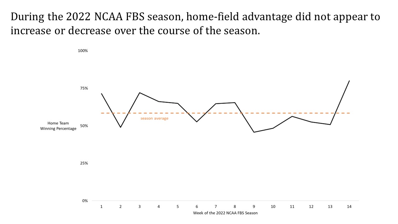
First, I was asked to evaluate the question: Does home-field advantage evolve during a college football season? To answer this question, I first added a column to the data named HT Win. I populated this column using Microsoft Excel’s =IF function, returning TRUE if the home team scored more points than the away team and FALSE if the away team scored more points than the home team. Then, using a pivot table, I determined the number of games played during each week of the season and the number of these games won by the home team. In creating this pivot table, I excluded all games played at neutral sites.
My next step was to create a time-series plot with the week of the season on the horizontal axis and the home-team winning percentage for that week on the vertical axis. I applied good storytelling principles to the design of the plot, and I added the chart to the slide below. My conclusion, based on the chart, is that there is no apparent pattern. I captured this conclusion in my assertion (see the slide below).
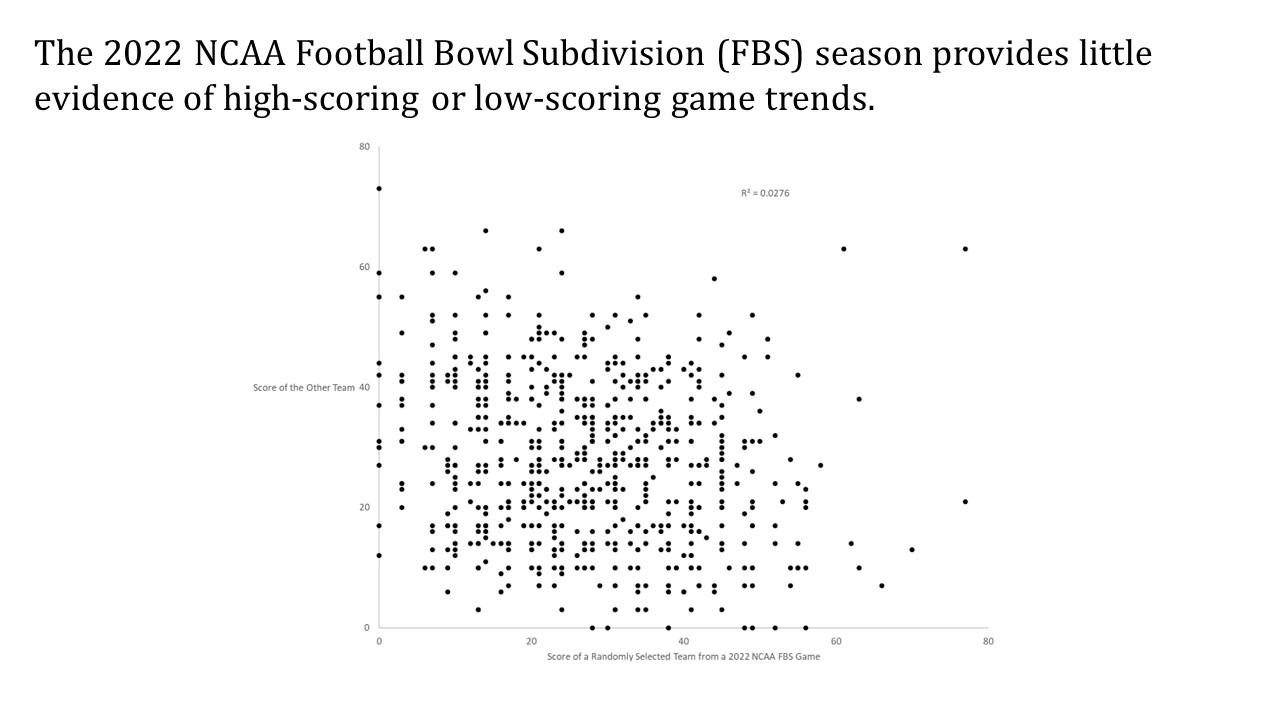
 A little bit about the second graph …
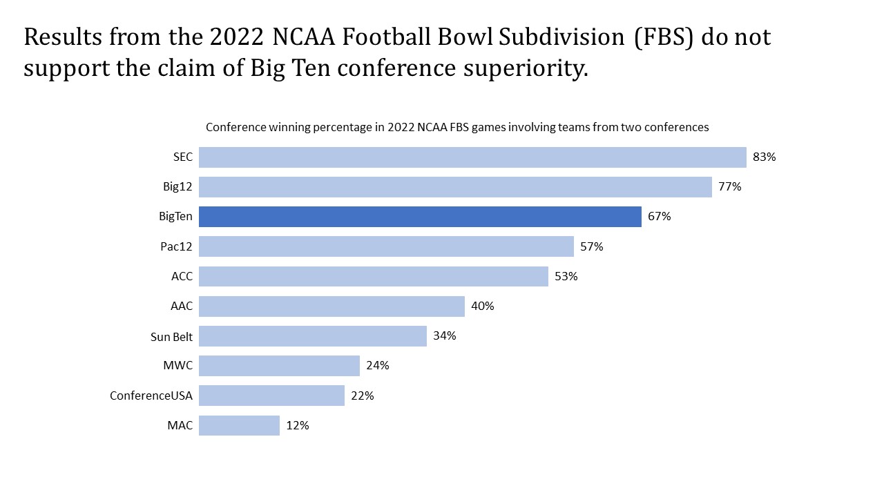
A little bit about the third graph …
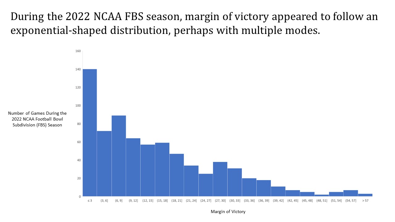
A little bit about the fourth graph …